.webp)


October 21, 2025
Stories behind the WNBL26 Indigenous Round jerseys


Check out the stories and designs around each of the Indigenous Round jerseys for WNBL26.
Share on Social
Related Tags
The WNBL's Indigenous Round will be held across Round 2 and 3 during the 2025-26 season.
Every club's jersey has a unique story, with all the details explained below once revealed by each team.
Southside Melbourne Flyers
Artist: Tiffany Hunter
Jersey design story: Taungurung
Flying with the stars in the sky, where dreams are reached higher than clouds, two powerful boomerangs, one with the colours of the Aboriginal flag, the other with the Torres Strait Islander flag. These are symbols of flight, resilience, and legacy, and the elite team players representing the oldest living culture in the world at a high level on the court.
At the heart of the artwork is Bunjil, the eagle, protector, creator, and guide. Bunjil watches over with deep wisdom, his wings stretched wide above land, water, and mountain.
Surrounding the centre are the elite WNBL team ‘Flyers’, strong, skilled, and standing tall. Representing excellence. They don’t just support, they elevate. They are leaders, mentors, and protectors, keeping the circle tight and the vision strong.
The stars remind us that when we dream, we dream big. We fly not alone, but with the stars. Guided by those who came before and illuminated by those we are yet to become.
'Reach high. Always dream big. You belong in the sky.'
Butterflies symbolise transformation, growth, and the beauty of change.
Sacred rivers stretch across the plains and rise through the Dandenong Ranges, grounding this vision in Country, reminding us that while we reach for the stars, we are always held by the land and legacy of the Wurundjeri people.
This artwork is about flight but never forgetting where you came from. It is about dreams, but always honouring Country. It is about rising, but doing so together, with courage, culture, and heart.
So, fly with the stars in the sky. And never forget, you were born to.
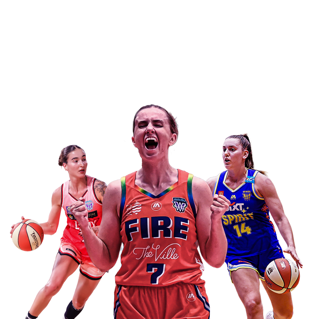
Townsville Fire
Artist: Chris Gray, proud Goori man from Bundjalung Nation (@chris_deadly_art)
Jersey design story:
This art piece, created for the Townsville Fire for the 2025-26 Indigenous Round, is located in the middle with a yarning circle showing all the players together preparing for the upcoming season.
The white dotted line underneath the players represents their journey together from where they come from to where they are now.
The white dots connecting to the connection circle symbols represent the team’s season journey to many different regions throughout the country.
The orange dot artwork not only represents the Townsville Fire colours, it acknowledges our culture, our stories, our bloodlines, our connection to Country, and walking together to create a better future.
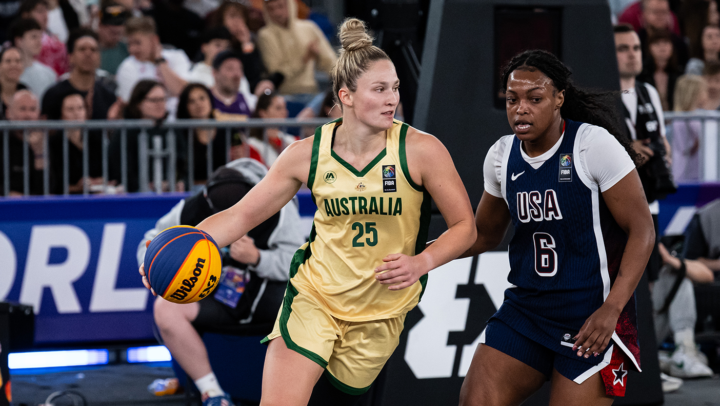
UC Capitals
Artist: Richard Allan
For a third season running, the UC Capitals are deeply honoured to collaborate with Ngunnawal artist Richard Allan, a proud Ngunnawal man, to create a jersey that is far more than fabric and thread. It is a tapestry of heritage, identity, and connection to Country.
Jersey design story:
This year’s Indigenous Round uniform is a celebration of the land we play and train on, Ngunnawal Country, and the rich cultural roots of Monique Bobongie.
Woven into the design is the sacred totem, the wedge-tailed eagle, a symbol of strength and vision shared by both the Ngunnawal people and Monique’s Mununjali family from Beaudesert, Brisbane.
The dolphin represents Monique’s Badtjala heritage from K’gari (Fraser Island), while the stingray is a proud emblem of her family from the Moa and Badu Islands in Kaurareg (Torres Strait Islands) and her South Sea Islander lineage from Malaita in the Solomon Islands.
The two sea creatures glide alongside traditional patterns that speak to the power and grace of the women who wear this jersey and the Country they represent.
Every detail, crafted by Richard, tells a story of resilience, belonging, and pride. Each time the team steps onto the court, they carry those stories with them, wearing the words NGUNNAWAL COUNTRY on their shoulders.
Those words also appear on the team’s home and away jerseys this season so that the Caps can celebrate local culture every time they play, at home or away.
This Indigenous Round celebrates Ngunnawal Country, First Nations culture, and Monique Bobongie, whose story is stitched into every thread.
Sydney Flames
Artist: Stewart James
Artist bio: Stewart James is a proud Wiradjuri man from Narrandera, residing in Young, NSW. He has over 20 years of experience as an artist and more than 15 years working in education. The 2025-26 season will be his fifth with the Hoops Capital club.
Nation: Wiradjuri Country
Jersey design story: We Are the Flames – A Story of Identity
This design reflects identity, a reminder that to move forward, we must first know who we are and where we come from.
Rooted in the stories that shaped the Sydney Flames, the artwork honours the club’s proud legacy, representing not only the team but the people, places, and communities across Sydney.
At the centre of the design are five meeting place symbols, acknowledging the ancestral lands and waters of the many First Nations Clan Groups across Sydney. These symbols speak to ancient connections, the foundations of identity and belonging.
Radiating from them are swirling lines, showing the ongoing link between old and new stories, past and present generations. These lines represent a living journey, rewritten every time the Flames take the court.
The same five symbols also represent the club’s five championship titles, a tribute to its success and legacy.
Diamond-shaped patterns woven throughout the design symbolise strength and protection, inspired by traditional shield markings, and serve as a reminder of resilience and cultural pride.
Circular patterns reflect Sydney’s rich cultural diversity and shared knowledge, representing unity among people from all walks of life who proudly stand behind the Flames.
Through this design, identity is not just told, it is worn, honoured, and celebrated.
The Flames don’t just play for Sydney. They are Sydney.
Adelaide Lightning
Artist: Temaana Yundu Sanderson-Bromley
Artist bio: Proud Adnyamathanha, Narungga, and Wangkangurru-Yarluyandi man.
Living in Adelaide on Kaurna Country, Temaana maintains a strong connection to his Yarta (land), especially the Flinders Ranges.
Temaana reflects his culture and stories from Country, learned from family and elders. His art combines traditional and contemporary themes.
He founded Mardlaapa Designs in 2021, producing apparel, workshops, and commissioned pieces.
He also studies Marine and Wildlife Conservation at the University of Adelaide and works at the Aboriginal Basketball Academy (ABA) as a board member and mentor.
Temaana was supported by ABA students in the jersey design process, where they provided key concepts and direction.
Jersey design story:
This artwork tells the story of the Adelaide Lightning and Kaurna land, the Adelaide Plains, and the waterways that stretch throughout it.
The centre circle, where the player’s number sits, represents the team on game day, with players and staff beside the Karrawirra Parri (River Torrens), working together toward success.
Water sources were and continue to be essential to Aboriginal people, offering food, medicine, and water. They also hold cultural and spiritual importance.
Scattered across the design are kangaroo tracks, a symbol of continual forward movement. They represent the team’s journey, facing challenges but always rising and pushing ahead.
People seated along the riverbanks represent the wider Adelaide Lightning community, stretching across South Australia.
Four pink stars on the jersey front pay tribute to the club’s four championships and four retired jersey numbers.
The stars are a reminder of the club’s legacy and history, inspiring future generations.
The side panels represent the ocean shorelines of Adelaide, grounding the jersey in local Country.
On the back, a mountain range represents both the Adelaide Hills on Kaurna Country and the artist’s own Country, the Flinders Ranges.
The flowing rivers across the jersey represent the connection between the Adelaide Lightning and the Aboriginal Basketball Academy.
Nine pink stars on the back mark the nine years of the ABA, celebrating an initiative providing educational and sporting opportunities for Aboriginal students.
Geelong Venom
Artists: Kasey and Jess Tattersall, founders of Sista Studios
Nation: Wollithiga/Yorta-Yorta
Sista Studios is a local art brand created to increase representation of Aboriginal culture.
Jersey design story: This artwork is inspired by the bay, local waterways, and the themes of connection and community. It tells the story of each player’s journey to basketball, shaped by people and place.
The flowing lines symbolise that journey and the support from family, friends, and community.
This piece honours everyone who makes basketball possible and celebrates the connection between team, culture, and home.
Bendigo Spirit
Artist: Melissa Taylor
Nation: Dja Dja Wurrung & Yorta-Yorta
Melissa is a proud mother of two and a multidisciplinary artist deeply connected to her culture and community. Her work reflects her heritage through painting, weaving, and digital art.
Jersey design story:
“This artwork portrays Bunjil gliding across Country, symbolising strength, vision, and connection to spirit. The winding rivers and flowing lines represent the lifeblood of the land, while the tracks and patterns tell stories of movement, belonging, and ancestry. The vibrant use of yellow and blue highlights the balance between earth and water, and the ongoing relationship between people, culture, and Country.”
Perth Lynx
Artist: Jungari
Jungari is a proud Aboriginal artist from Warumungu Country in the Northern Territory. His work reflects his heritage across the Roper River region, with family ties from the Central Desert to Arnhem Land.
He was taught traditional painting by his father, Jabaljarri, and his art honours cultural continuity and identity.
Jersey design story: 2025 Perth Lynx Artwork – “Our Strength, Our Circle”
This artwork celebrates family, connection, and belonging.
At its centre, the players sit in a circle symbolising unity, sisterhood, and strength, not just as athletes but as women and leaders.
Surrounding them are their extended families, the people who stand beside them every step of the way.
The boomerang shape at the base pays tribute to tradition and resilience. Within it are the coaches, support staff, and volunteers who lift the team higher.
Spears point forward, symbolising the hunt and the drive to chase goals. Flowing across the canvas are the waterways of Perth, connecting Country and story.
In the background are the next generation of kids watching and dreaming to one day wear the jersey.
This piece shows what it means to be part of something bigger, a team, a legacy, a movement. It speaks to where we come from and who we stand with.
The pink throughout symbolises strength, sisterhood, and hope. It honours the bond between women and their communities and represents the dreams of the next generation, bold and ready to rise.
Follow us for the latest updates


.jpg)


.jpg)
.jpg)